





Digital Retention Experience
A digital retention experience for a telecom company — redesigning the journey for customers looking to cancel their internet or TV service. The goal: respect the user’s intent to leave, while giving the business a fair chance to retain them.
Context
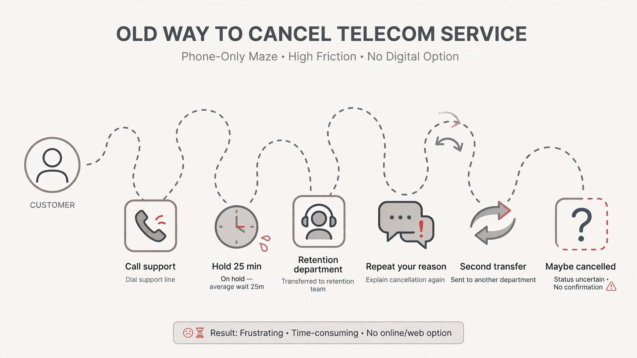
Customers who wanted to stop their internet or TV service faced a poor exit experience — and the business had no structured way to present alternatives before they left.
The project existed because of regulatory pressure: click-to-cancel rules in the U.S. pushed subscription businesses to let customers cancel online as easily as they signed up. The classic offender was the gym membership — trivial to join, painful to leave. The client needed a digital exit that complied.
My role
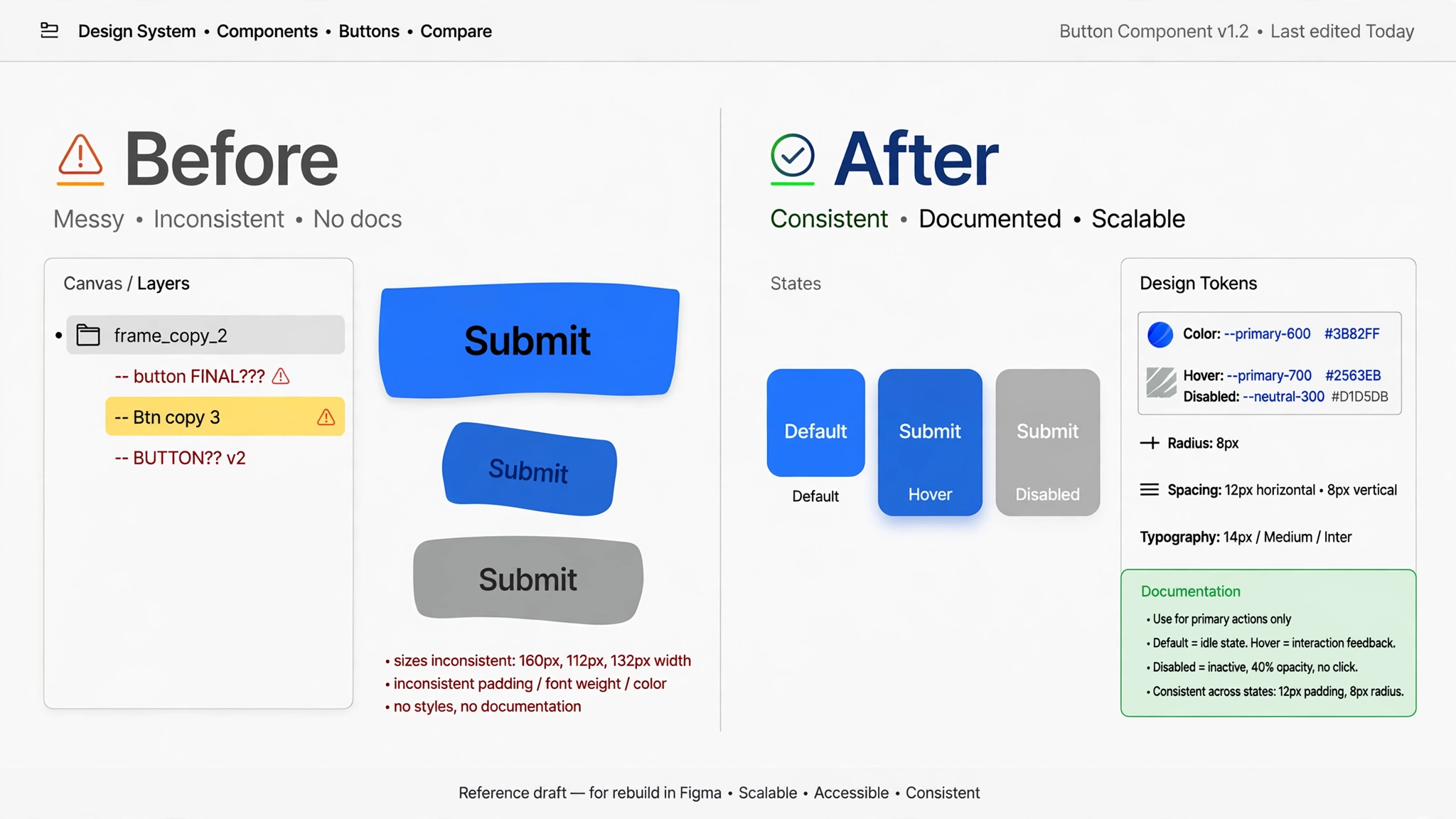
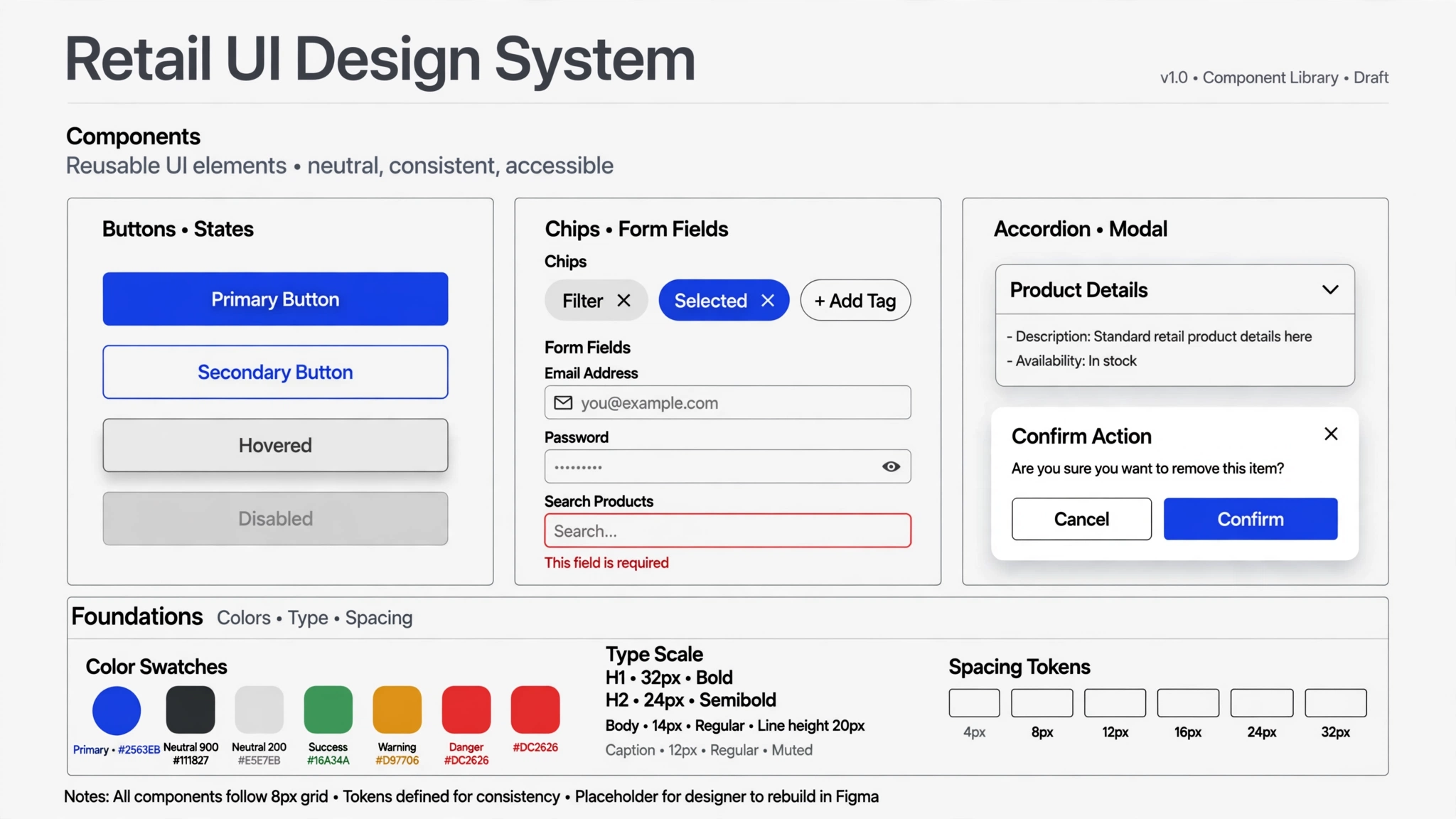
The work split by fidelity. The other designer worked fully in UX — research and low-fidelity wireframes — while I owned the UI side, touching UX lightly: I took the wireframes to high fidelity, applied the brand and the design system, and handled the fine-tuning — consistency across screens, button placement, and interaction details. Requirements came through our PM, a consultant who gathered what the client needed; the design team analyzed the problems and solved them in design. We also presented directly to the client — the main stakeholder was a senior lead on the client’s product team.
The design
1. Start from the call-center playbook.
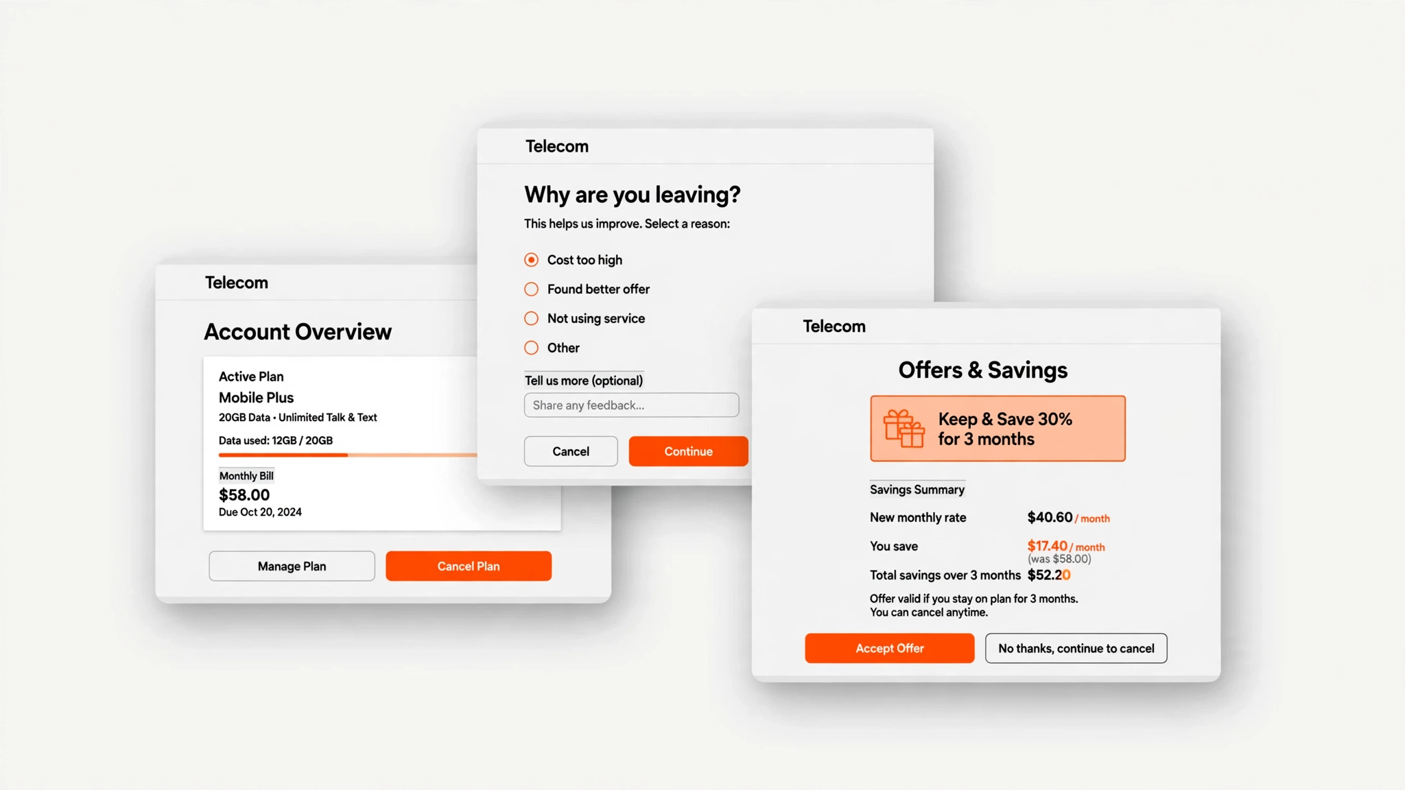
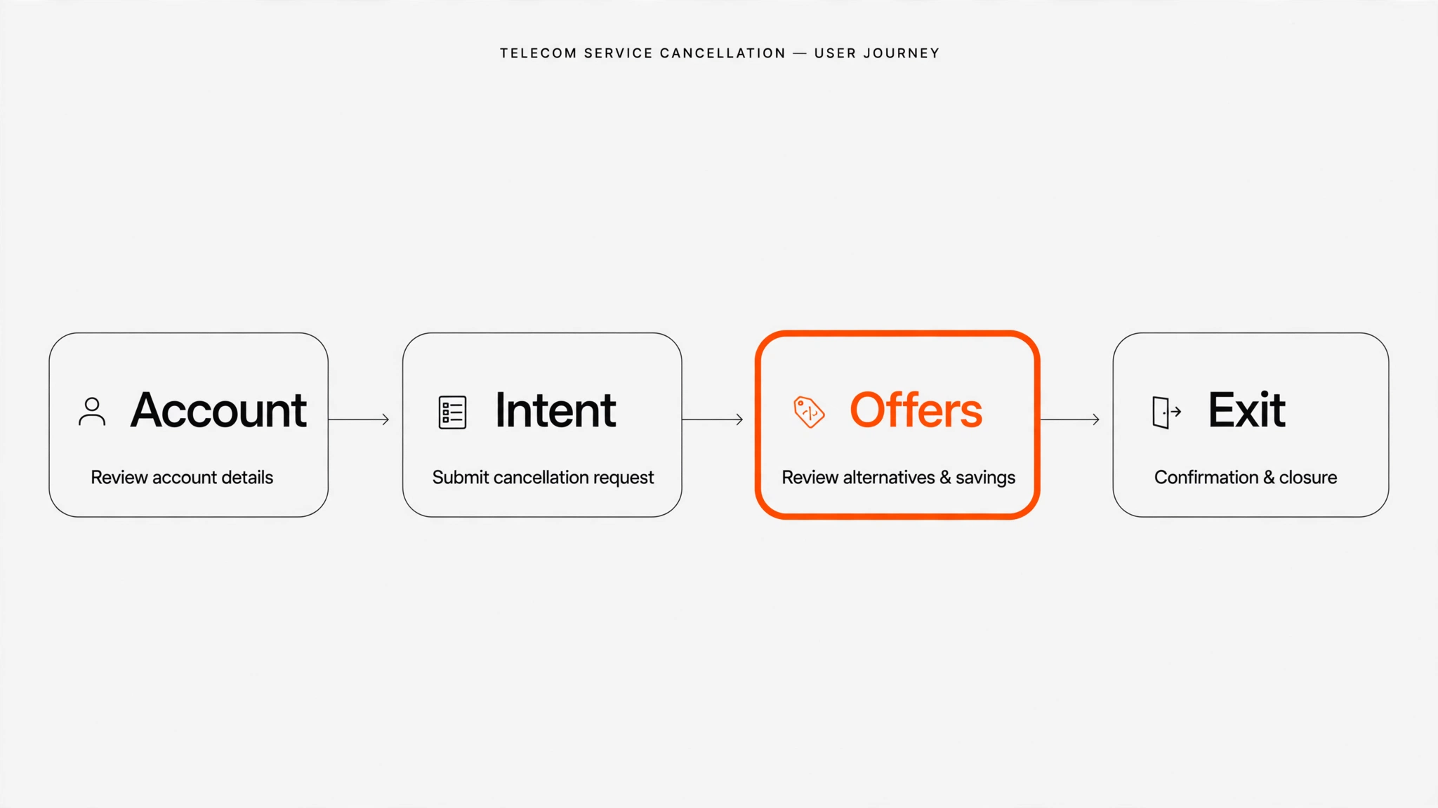
On the phone, retention agents ask why you’re leaving and make save offers. We translated that human process into a self-serve digital flow: account, intent, offers, exit.
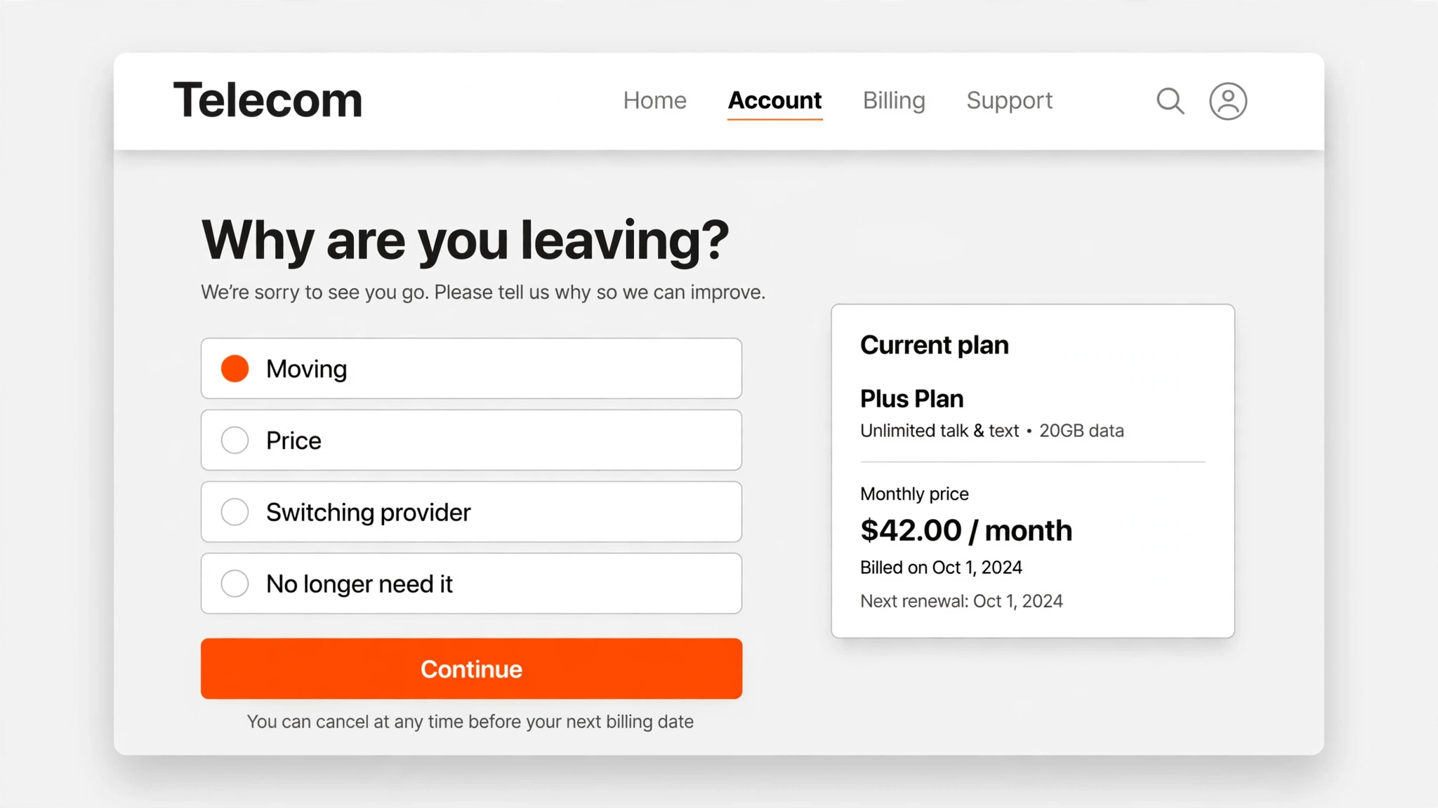
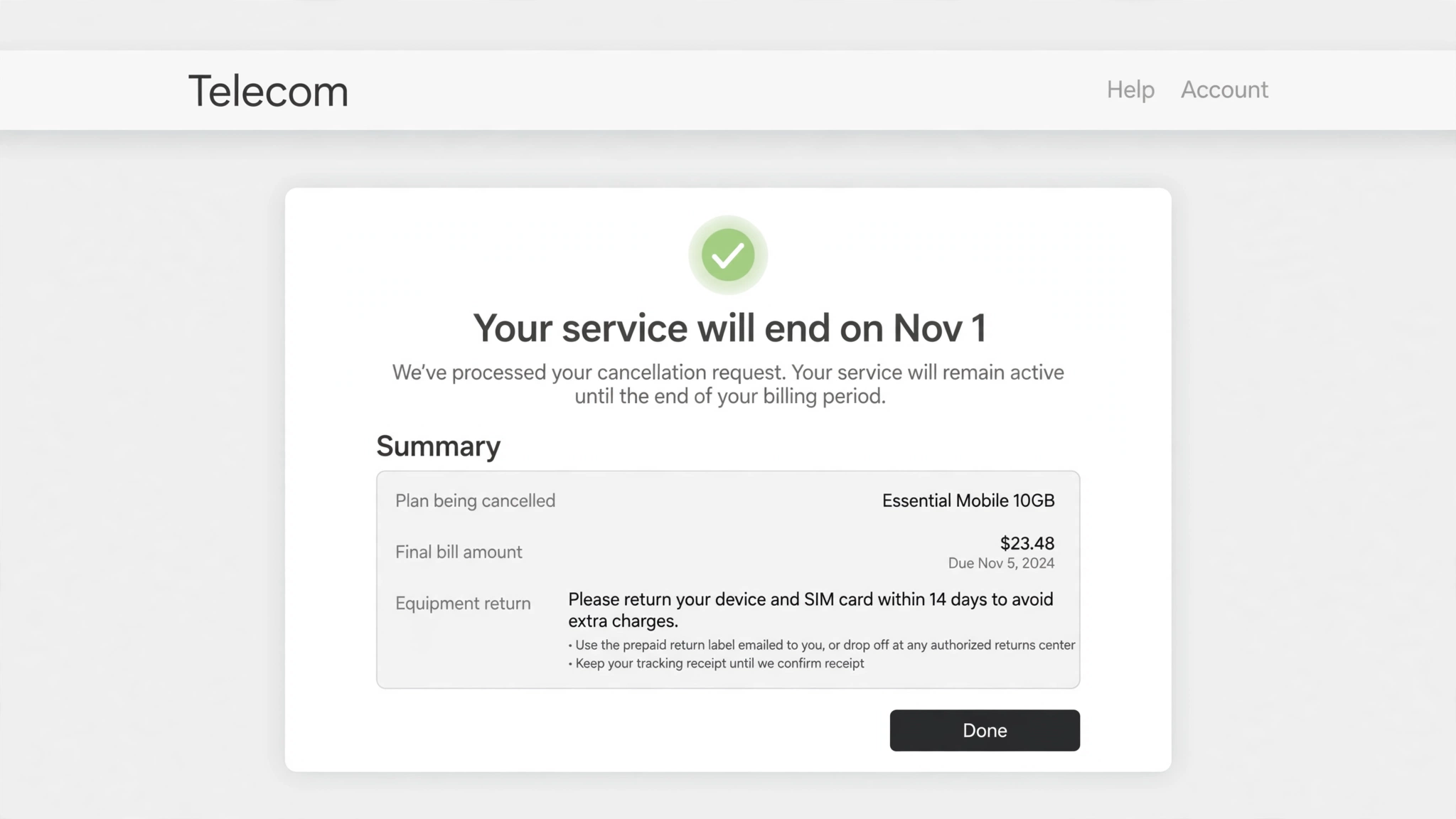
2. Make exiting easy — start from the user’s intent.
I improved the experience for users who want to stop their services, making it genuinely easy to exit. A one-click exit would be the purest UX — but it would bleed customers, so the exit stays reachable rather than instant. The tradeoff: what’s good for users isn’t automatically good for the business.
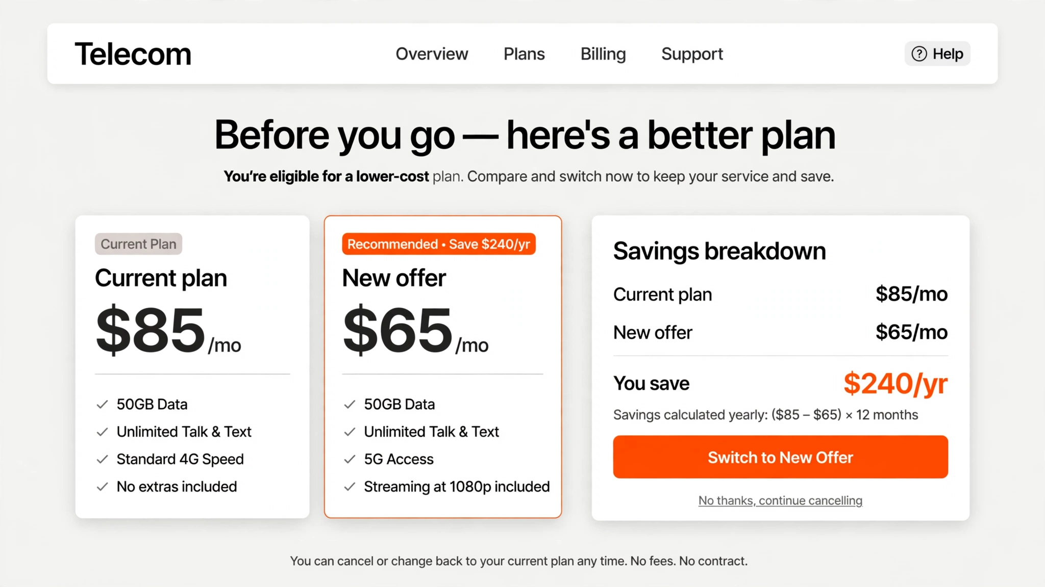
3. Earn the save: upsells, promotions, and clear calculations before exit.
To balance the business side, we added upsells and promotions into the flow — showing customers what they have and what they pay, then new offers with clear calculations of what they’d save or gain — before they complete the exit.
Outcomes
- Shipped a cancellation flow that makes exiting genuinely easy — no dark patterns.
- Built structured save opportunities into the flow: upsells, promotions, and clear savings calculations presented before the final exit.
- Regulation-ready: the flow gave the client a compliant online cancellation path — and a better exit experience — at the moment regulators were forcing the issue.
Reflection
Designing for the user who wants to leave and the business that wants to keep them forced every screen to be explicit about its tradeoff.
Full case study with visuals available in live portfolio reviews — contact [email protected].